ShopDreamUp AI ArtDreamUp
Deviation Actions


Suggested Deviants


Suggested Collections


You Might Like…


Featured in Groups
Description
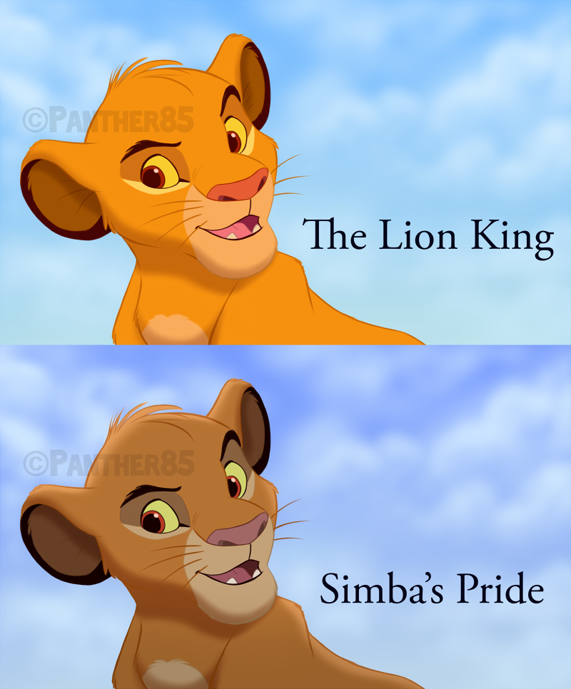
NOTE: My intention is not to bash Simba's Pride, I like the movie a lot, I just want to point out some differences between the two films because it's just fun to analyze this things, especially for many of us as artists.
I wanted to do this for a while, I'm pretty sure most Lion King fans know the animation style in TLKII is different to that of the first movie, the fluidity of the characters movements is pretty much the same quality, but when it comes to the coloring and shading, not to mention the redesigns, that's when you notice that the producers went a different route.
I was curious in how a characer that never appeared on the sequel, like cub Simba, would look like in SP style. Also, while most of the differences have been obvious since I first watch the movie, there are little details about the animation in SP that I never notice until very recently. At least to me, and I know this is completely a matter of taste, the first movie looks better, the animation is just nicer, and here's why.
1. The colors:
The first thing we noticed is that the colors are darker and more blueish is SP, this is because the directors thought that adding a blue layer to the film would give a darker tone to the story. Nice in concept but terrible in practice here if you ask me, some things like the sky look nice but the characters just look off.
2. The highlights:
In the first movie the characters do not have hightlights, these are reserved only for some cases, like Scar's mane due to how dark it is, and some especific scenes when the light is strong enough, but as a general rule there's no highlights on the characters.
3. The gradient:
If you look closely, there is a gradient effect in all the characters in SP, the effect in itself is neat, the problem is in my opinion, how they used it. In TLK it was only used in scenes like in the elephant graveyard when the hyenas were talking to Scar, which benefited from it, while In SP they use it all the time even when not necesarily. I also noticed that while in the graveyard scene in TLK the gradient seems to have green hue to it to match the environment, in the sequel they used just grey/black, which honestly make the characters look as if they were covered with dust.
4. The shading:
The shading is actually the very same, however, there is a little difference that I just recently noticed. While this is not consistent throughout the whole movie, in most scenes in SP the layer of the shading seems to be UNDER the line art as opposed to OVER it like they did in the original film. It's a little detail but this actually made a huge difference, as it made some of the lines disappear depending on the color. The reason Simba's mane looks a little weird (in some scenes, not all) is in part because of it.
5. The line art (in some parts):
Lastly, another little thing I recently noticed, and this is probably the only difference that's neither better nor worse in the sequel, but if you look closely, the underbelly and the area around the eyes have subtle, visible lines in SP but there are simply none in the original film except for Mufasa in his muzzle.
In conclusion, sometimes less in more. The original movie used only shading for the most part and it made the characters look vibrant and very colorful. Simba's Pride used plenty of effects and it just made the characters look saturated and not that pleasant to the eye in comparison.
Well, that's pretty much it, I hope the art shows clearly the differences that I mentioned. I made cub Simba's colors by taking his adult colors in SP and lightening them a bit.
Here's Part 2:origin()/pre08/1027/th/pre/f/2017/156/6/a/tlk_vs_sp__part_2__by_panther85-dbbozng.png) if you want to see an interesting switch
if you want to see an interesting switch  (Wink)")
_______________________________________________
I wanted to do this for a while, I'm pretty sure most Lion King fans know the animation style in TLKII is different to that of the first movie, the fluidity of the characters movements is pretty much the same quality, but when it comes to the coloring and shading, not to mention the redesigns, that's when you notice that the producers went a different route.
I was curious in how a characer that never appeared on the sequel, like cub Simba, would look like in SP style. Also, while most of the differences have been obvious since I first watch the movie, there are little details about the animation in SP that I never notice until very recently. At least to me, and I know this is completely a matter of taste, the first movie looks better, the animation is just nicer, and here's why.
1. The colors:
The first thing we noticed is that the colors are darker and more blueish is SP, this is because the directors thought that adding a blue layer to the film would give a darker tone to the story. Nice in concept but terrible in practice here if you ask me, some things like the sky look nice but the characters just look off.
2. The highlights:
In the first movie the characters do not have hightlights, these are reserved only for some cases, like Scar's mane due to how dark it is, and some especific scenes when the light is strong enough, but as a general rule there's no highlights on the characters.
3. The gradient:
If you look closely, there is a gradient effect in all the characters in SP, the effect in itself is neat, the problem is in my opinion, how they used it. In TLK it was only used in scenes like in the elephant graveyard when the hyenas were talking to Scar, which benefited from it, while In SP they use it all the time even when not necesarily. I also noticed that while in the graveyard scene in TLK the gradient seems to have green hue to it to match the environment, in the sequel they used just grey/black, which honestly make the characters look as if they were covered with dust.
4. The shading:
The shading is actually the very same, however, there is a little difference that I just recently noticed. While this is not consistent throughout the whole movie, in most scenes in SP the layer of the shading seems to be UNDER the line art as opposed to OVER it like they did in the original film. It's a little detail but this actually made a huge difference, as it made some of the lines disappear depending on the color. The reason Simba's mane looks a little weird (in some scenes, not all) is in part because of it.
5. The line art (in some parts):
Lastly, another little thing I recently noticed, and this is probably the only difference that's neither better nor worse in the sequel, but if you look closely, the underbelly and the area around the eyes have subtle, visible lines in SP but there are simply none in the original film except for Mufasa in his muzzle.
In conclusion, sometimes less in more. The original movie used only shading for the most part and it made the characters look vibrant and very colorful. Simba's Pride used plenty of effects and it just made the characters look saturated and not that pleasant to the eye in comparison.
Well, that's pretty much it, I hope the art shows clearly the differences that I mentioned. I made cub Simba's colors by taking his adult colors in SP and lightening them a bit.
Here's Part 2
if you want to see an interesting switch _______________________________________________
DISCLAIMER:
You are NOT allowed to use, trace or edit my art and upload it on the internet without my permission, not even if you give me credit. You need to ask me first.
Simba © Disney
Art © Panther85
Image size
800x966px 451.93 KB
© 2017 - 2024 Panther85
Comments93
Join the community to add your comment. Already a deviant? Log In
Мне очень не нравится во 2 части цвета ,тени ,и графика в целом .хуже 1й части. Это не саванна а потёмки какие то . Мягкие черты,не выраженные когти лапы и клыки у львиц прайда ,хотя в первой части нала во время охоты была ну супер львица,во второй против Витани она была как булочка мягкая и совсем без клыков . И Симба против зиры,его лапа была как булочка,а не как лапа с когтями например у муфасы из 1 части .